Charts
Charts are predefined to show specific information in an appropriate format, such as pie charts or lists. They are organized into categories, and can be added to, removed from, and organized on dashboards.
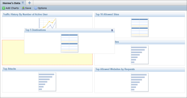
In a profile dashboard, the charts are shown as placeholders. When viewing the charts in the device summary (see
“View managed devices”), they will be populated with real-time data.
The currently available predefined charts are outline in
Table 10.
Table 10: Available predefined charts
Event |
Top SSL-VPN Tunnel Users by Bandwidth | Top SSL-VPN Web Mode Users by Bandwidth | |
IPS (Attack) |
Top Attack Victims | Top Attacks | Top Attack Source |
Network Scan |
List Number of Vulnerabilities | | |
Traffic |
Top Users by Sessions | Number of Sessions for Past 7 Days | Top 5 Applications by Bandwidth |
Traffic History by Number of Active User | Top 5 Email Senders | Top Recipients by Combined Email size |
Top 5 Destinations | Top Site-to-Site IPsec Tunnels by Bandwidth | Top Destination Addresses by Sessions |
Top 5 Applications by Sessions | Top Recipients by Number of Emails | Email Receivers Summary |
Top 5 Email Recipients | Top Applications by Sessions | Top Destination Addresses by Bandwidth |
Traffic Summary | Top Users by Bandwidth | WAN Bandwidth for Past 7 Days |
Top Senders by Number of Emails | Top Dial-Up IPsec Tunnels by Bandwidth | Top Applications by Bandwidth |
Email Senders Summary | Top 5 Users by Bandwidth | Top Senders by Combined Email Size |
Virus |
Top Viruses by Name | Top Virus Victims | Top Viruses by Name |
Web Filter |
Top Web User by Bandwidth | Top Video Streaming Websites by Bandwidth | Top Web Users by Requests |
Top 10 Allowed Sites | Top 10 Blocked Sites | Top Allowed Websites by Request |
Top Blocked Websites | Top Blocked Users | Top Allowed Websites by Bandwidth |
To add a chart to a dashboard:
1. In the RTM Profiles tab, select an RTM profile and the dashboard within that profile to which you would like to a add a chart.
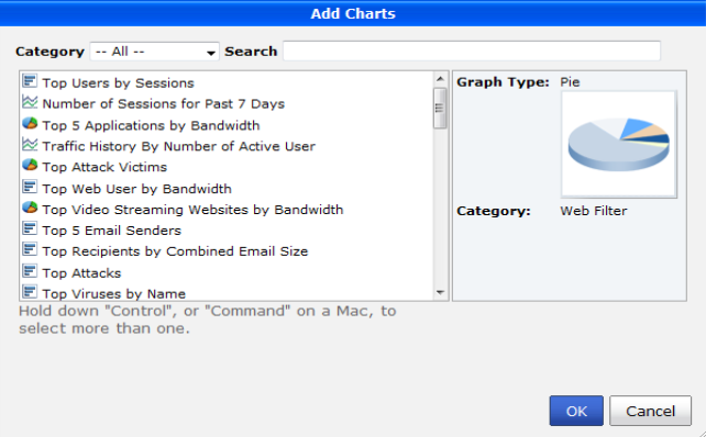
2. Select Add Charts in the content pane tool bar.
The Add Charts dialog box will open.
3. Find the predefined chart that you would like to add in one of the following ways:
• Browse the list of all the available the available charts.
• Select the category of the chart you are looking for and then browse the list of the charts in that category.
• Search for the chart by entering all or part of the chart name into the Search field.
Once you select a chart, the graph type and the chart’s category will be displayed in the preview box on the right of the dialog box.
4. Select OK to add the chart to the dashboard.
To reorganize the charts on a dashboard:
1. In the RTM Profiles tab, select an RTM profile and the dashboard within that profile that you would like to reorganize.
2. Click and drag any of the chart placeholders.
The selected chart will follow the pointer so long as the right mouse button is held down. A yellow spacer with a dashed red outline will appear in the location where the chart will be once the mouse button is released.
4. When the outlined yellow spacer box is in the location that you want the chart, release the mouse button and the chart will fall into place.
5. When you are finished reorganizing the dashboard, select the Save button in the content pane tool bar to save your changes.
To remove a chart from a dashboard:
1. In the RTM Profiles tab, select an RTM profile and the dashboard within that profile that contains the chart you would to remove.
2. Select the garbage can icon in the top right coner of the chart placeholder that you would like to remove.
3. Select OK in the confirmation dialog box to remove the chart from the dashboard.
4. When you haved finished removing charts, select the Save button in the content pane tool bar to save your changes.